Two Worlds is being updated
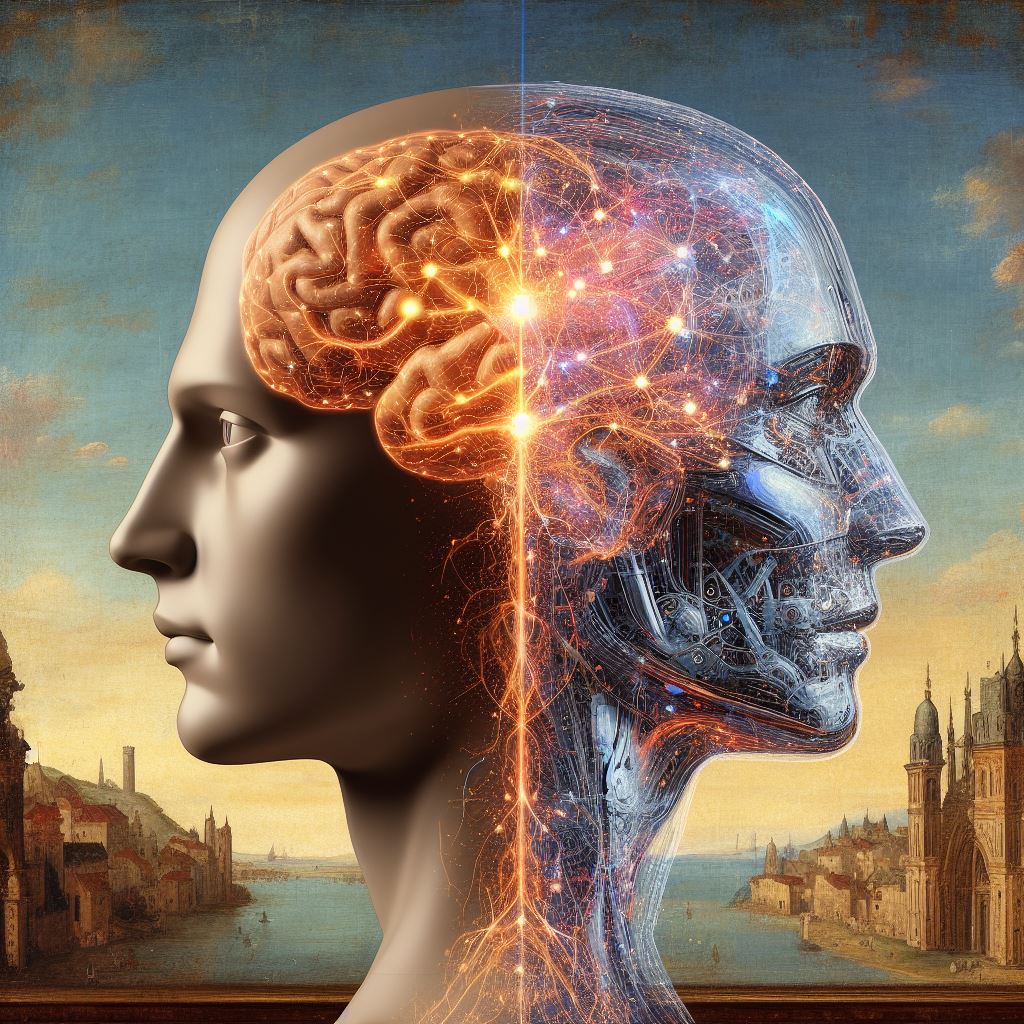
Two Worlds is a innovation consultancy and incubator, with a 27 year track record in both facilitating and creating award-winning innovative products, from the immediate to the strategic. Our focus is on the fusion of big data, AI and classical analytics which supports effective insight, forecasting and decision making.
We're currently simplifying and rebuilding our web site, so please bear with us for the moment. In the meantime, if you have any queries, please email: info@two-worlds.com