
The time to relax lockdown is once you have a combination of low case numbers (check), an R (infectivity) number that’s well below 1 and trending downwards, and have effectively stamped on any potential hot spots around the country, to the point where the increased travel between areas that we’re already seeing doesn’t risk a spread from those hot spot areas acting as reservoirs of reinfection.
And this does not look like that time. Yes, case numbers are low (rolling weekly rate/100k population across the UK is around 26), but…
…we do have hot spots of higher case numbers: Leeds, Bradford, Glasgow & North Lanarkshire are, for example, sitting in the 56-75 weekly rolling cases/100k range. Yes, that’s usefully less than the figure of 300+ we were seeing for those areas at the end of last year, but it still indicates a pandemic with some momentum and where the rate of deceleration in cases is falling – it’s not rising yet, but isn’t that far off. Then there’s the R number, which is around the 0.85 figure across the UK, but with a number of areas which are already significantly above 1. That’s a potential indicator of resurgence to come – the animation here shows our analysis and forecasting of R numbers across UK local authorities from 10 April (the last day for which we have published figures of cases by date confirmed, as opposed to the UK government and media’s headline figures of the number of cases reported each day, which says more about the reporting system than it does about the pandemic).
The animation runs through to 4 May, using our mathematical model that compensates for the poor quality of reporting in the published figures before running the forecasting algorithms.
It doesn’t make for entirely comfortable viewing – you’ll see exactly where we’re forecasting rises in R number (the darker the shade the worse it may be) in particular areas. These of course, once people are moving around more, will simply drive case rates up again across the country.
Consider the usual disclaimer made here: these are forecasts, not predictions and, like weather forecasts, the further out you get, the more uncertainty there is, especially when case numbers are low and where it doesn’t take many cases to kick up the R number (any white areas on the map are where we’re seeing numbers too low to calculate a significant forecast). But the evidence from our data and models (on which we appear to run a far more timely analytic cycle than most) doesn’t fill us with confidence.
Issued by the Department for Raining on the Wishful Thinking Parade.
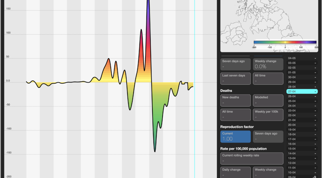
The header image shows the Pandemic Force (it’s magnitude, direction and rate of acceleration or deceleration) to 10 April.