
In developing our daily-predictive AI for Covid-19 infections , we’ve come across some, ah, interesting quirks in the official UK data: previously, we’d been using the government’s daily download data set for England, hoovering it into udu and thence driving the internal and R-based analytic and learning models. We’ve done the same for Scotland, Wales and Northern Ireland, from their respective data gateways, and merged the outcome to create a consistent baseline for analysis. Overall then, a bit clumsy, but perfectly workable.
And now the government has produced a decent and properly documented API from which we can grab whole-UK data at multiple levels, which we’ve duly adopted. So our data science team got hold of the time series from the API. And…
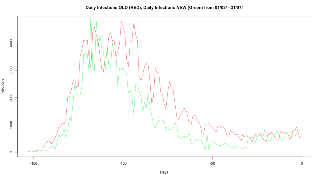
…in the top image we see the difference between the ‘old’ data that ran up to 2nd August, and the ‘new’, which covers the whole period of the pandemic, so we’ve graphed the difference in Covid-19 incidence (not deaths – that’s a separate issue) from the end of March to the end of July. And you’ll see that, between around 110 days before the end of July and the end of June, there’s rather more than a minor discrepancy.
We’ve been in touch with the coronavirus.data.gov.uk team and – within their readily acknowledged constraints of time and resource – they’ve been very helpful. It does appear that the overcounting in that central period of the graph is down to duplication between data sets as testing in Pillars 1…4 was incorporated, something that they’ve now been able to remove. There’s also something of a timeshift, which is down to moving to test dates rather than test result publication dates. And this discrepancy appears to apply only to data for England: make of that what you will.
I don’t (despite well-founded scepticism of the current government) see anything beyond that to fuel conspiratorial paranoia, but it does illustrate the need to have a long-term, robust and responsive national process and infrastructure for data collection and analytics, and not just for Covid-19: it’s not our first pandemic, it won’t be our last, and it’s simply a short, sharp test run for climate change. Think on that.
And you’d think that a G7 country (still, just) would give its data science teams sufficient resource to allow them to build an autoscaling cloud that didn’t require them to limit API calls to 1,000 records at a time, wouldn’t you?
Update: we’ve been chasing this discrepancy down for a week or so now but, hot off the press, as I’ve been writing this, the government has announced that this restating of the data lowers the overall death count by around 5,400. This appears to be an artefact of changing the figures for England to match the 28-day-elapsed death reporting used in the other UK nations, so doesn’t appear to be related to the ‘duplicated test data’ information we’ve been given, so there are two separate adjustments here, which I however see are being conflated in media reports, including by the BBC, who ought to know better.
We’re digging into the ramifications of both however: there’s nothing a data scientist hates more than inconsistent data. Well, that and warm beer…
Development of Two Worlds’ analytic platform for the Covid-19 pandemic is supported by InnovateUK under R&D grant 54368.