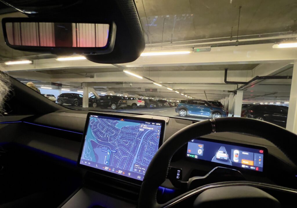
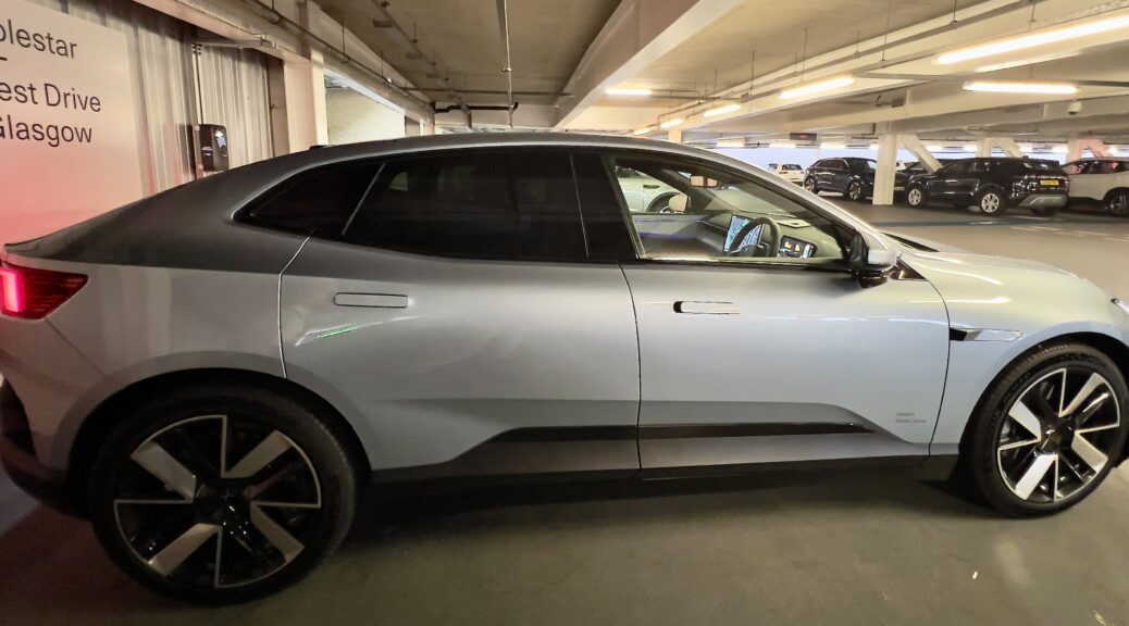
Poor design is a broad canon, but is rarely more visible than in the human interface of motor vehicles (cars and bikes both). Here, the growth in electronic ‘features’ has long since overtaken a focus on actually getting from A to B (and onwards) with a modicum of of safety and with at least the potential for maintaining whatever peace of mind with which you started the journey. And that process has accelerated since human interface design got taken over by corporates with apparently zero understanding of (or interest in) the process of driving or riding, but with a marketing-driven emphasis on creating chargeable new features.
In my case, I’ve been driving a Tesla for the last five years, so have plenty to say on that subject (and will), but today’s issue is courtesy of Polestar, and one which falls under the bad design headings of ‘Gratuitous Reinvention’ and ‘Consequences’. And, of all things, it’s a failing from an attempt to reinvent one of the oldest tools created by our species: the mirror.
The new Polestar 4 is a mid-sized (by European reckoning) almost-SUV. Having test driven it, in many ways it’s an excellent and up-to-the-minute car. But, of all things, they’ve managed to screw up the rear view mirror, to the point where the impact on safety and driver fatigue is going to be a deal breaker for many.

Specifically, it’s about the lack of a mirror or, rather, the fact that they’ve replaced it with something that doesn’t work anything like as well as the original and which, for many people, doesn’t work at all.
Which is where the ‘Consequences’ bit kicks in. The starting point here is Polestar’s decision to remove the rear window, effectively forcing them to provide the central element of rearward vision with a digital display, fed by a rear-facing camera.
They claim that this provides more interior space for the rear seat passengers. Which indeed it does. And many modern cars have steeply raked rear screens which significantly limit rear vision (the Tesla Model 3 being a good example). So that was decision 1. At that stage, providing rear view with a camera doesn’t seem like too bad an idea.
Decision 2 in the game of consequences was then driven by what was – on the face of it – another not unreasonable desire: to provide the driver with a familiar experience. So they chose put the rear vision screen in a normal looking rear view mirror housing. And that’s where it all went pear-shaped.
What they’ve failed to take into account is that a screen is not a mirror: a mirror’s focal plane is that of the virtual image it displays, not the surface of the mirror, so is effectively at infinity. Which is where you want it to be when driving – that’s how you’re focussed looking forward, so you don’t need to refocus when looking at the rear view.
But that’s not how a display works: here you’re focussing on the plane of the screen itself. Which means that every time you flick your eyes from the forward view to the pseudo-mirror, you have to refocus. If you can.
Which I can’t. In common with millions of others, my eyesight isn’t perfect, and the ageing process has ensured that, at distances less than about 35cm, I need reading glasses. So I’m fine on normal car instruments, and so on out to infinity. But guess how far the pseudo-mirror housing in the Polestar is from my eyes? Yep, about 30cm, and actually closer than it is in most cars, due to the Polestar’s long and steeply raked windscreen. So, no matter how hard I tried, I couldn’t focus on the damn thing. After 45 minutes or so, I was getting a noticeable headache.
The next point is that, even if you can focus switch perfectly, that becomes tiring, whatever the condition of your eyes. There is also always a brief lag when switching from one focal point to another, something which is independent of your personal number of tree rings.
Finally (at least until I think of something else) you get a degree of parallax in a mirror, enabling you, with small head movements, to better judge what traffic approaching from behind is up to. You don’t get that with a display.
So, in the name of providing a bit more legroom in the back, and then trying to maintain the familiar interface, Polestar has provided us with a spectacular failure of user-centred design, creating an element of the car’s information interface which works far less well than existing (and cheaper) technology, and whose impact ranges from ‘merely’ being tiring and annoying to potentially dangerous. It’s certainly a deal-breaker for me.
Of course, if they hadn’t been so hung up on the skeumorphism of retaining the mirror housing, they could have mitigated it: the car has the usual large (and very clear) central dash display, plus the driver’s information screen in the usual place. Both of which are at an entirely reasonable distance from the driver’s eyes. So, by sacrificing a little of the central screen real estate, they could have provided a much better view, and more cheaply. That decision could then in future enable them to offer a fully synthesised 180º (or more) view of what’s going on past the driver’s normal peripheral vision. Which could be a genuine step forward, at least for human-engaged driving.
The potentially good news is that this is a fix that is almost certainly doable in software, assuming of course that Polestar has properly cracked the model for Over the Air (OTA) software updates. All they’d need to do then is remove the bloody fake mirror housing, or relegate it to its alternate mode: that of watching little Johnny and Jemima in the back seat picking their noses or arguing over the game controller.
But, of all people to make a cock-up like this, for it to be an offshoot of Volvo, with their storied past in human-centred design and safety engineering, is near incomprehensible. Something has clearly gone wrong with their whole design and engineering culture. I’d love to know what – anything else I say now would be mere speculation.

